I've taken products from zero to growth three times. Currently, a founding designer at Zenskar, an AI-native revenue automation company backed by Bessemer and fresh off a $15M Series A.
Years shipping enterprise B2B SaaS products
Raised by founders I've designed for
Founding-stage engagements, all past PMF and in growth
From the first whiteboard session to a product in production. I work best in the early, uncertain stage: defining the conceptual model before any screens exist.
Complex domains are my home. I find the mental model that makes hard products feel obvious. Pricing engines, workflow builders, AI-assisted tools.
I've built teams, run studios, and worked alongside founders. I speak both design and business, and I know when to push back and when to ship.
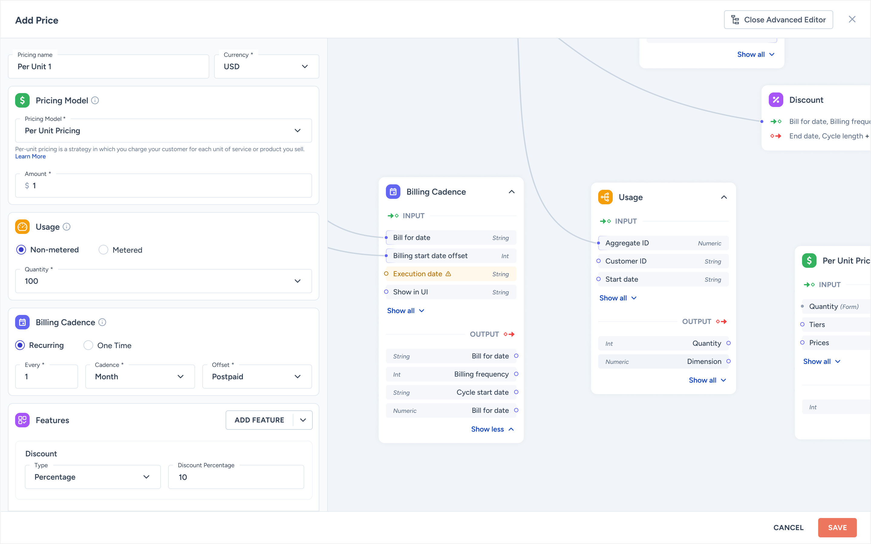
Reframed the mental model from "configure a subscription" to Products → Prices → Contracts → Invoices. A two-mode edit panel auto-switches between simple and advanced, and a non-linear preview lets sales reps verify an invoice before signing the contract.
Led the platform redesign across three modules (Knowledge Base, Document Ingestion, Workflow Builder) for a top-3 US wealth manager. Shipped beta in three months. Studio acqui-hired on a three-year contract.
Founder & lead designer. Shipped for 40+ B2B clients in fintech, healthtech and dev tools. Entire team acqui-hired on a three-year contract. A clean exit and the start of the wealth-management chapter.
AI-native revenue automation, $15M Series A. Led the contract canvas redesign and the design system from scratch. 40+ weekly demos rely on the work.
Conversational AI for top-3 US wealth managers. Led the platform redesign across Knowledge Base, Document Ingestion and Workflow Builder. Closed the company's largest deal.
10-person product studio in Kerala. 40+ B2B clients across fintech, healthtech and dev tools. Acqui-hired on a three-year contract.
The CS degree is for the engineers. The philosophy degree is for the founders. The UX education was for everyone in between, and is still the foundation I work from.
Recognised by Enterprise IT World MEA for design work in conversational AI. Currently hosting season 3 of Behind The Screens, a design podcast for B2B SaaS designers.
Same answers I'd give a hiring manager in a first call, but at 2am and without the meeting invite. Replies are short and specific.
From founders and colleagues I've worked closely with.
Paul has a rare ability to take an abstract, complex domain and make it feel immediately intuitive. He doesn't just design screens. He designs the logic underneath them.
Working with Paul on CogniCor was unlike any design engagement I'd had before. He shipped a platform in 3 months that most teams would've taken a year to build, and it was good enough to close our biggest deal.
Paul understands how enterprise buyers think. His design decisions always connected to our sales narrative, which made every demo feel tighter and more credible.
Week-by-week: what to prioritise, what to skip, how to earn trust fast. And the three things I do in week one before I touch Figma.
8 min read →Generated UI gets you to a demo. It does not get you to a contract. A field guide to the seams that lose enterprise deals, and the editorial moves that close them.
11 min read →The word "Graph" lost us a six-figure deal. The word "Base" closed the next one. A short essay on why product nouns are a designer's most under-priced lever.
6 min read →Three months into a re-do of Zenskar's contract canvas, halfway through season three of Behind The Screens, and reading more philosophy than is probably useful for a product designer.
I'm taking one new engagement starting Q3 2026. Series A or post-pre-seed, B2B, AI-native preferred. Open to founding hire, design partner, or a six-month "ship the second version" contract.